Process and Materials for Two Watercolors
Last night was even worse than most nights because the cats were SO BAD. We are trying to find a good balance. Puppy is capable of sleeping all night in the bed, and she likes to do it; but John is NOT capable of sleeping all night (or any portion of the night) in the bed, and when you let him stay in the bedroom at night he bites your hair and your thumbs and tries to get his head under your face and knocks over the water bottles on your bedside table. But they like to be together, so it's hard to find the balance. Last night we left the door to the bedroom open and John came in and tried to knock over the flowers my parents sent while I was sick, and then Puppy decided that she would try to get me to feed her, and since I wanted her to stop licking my feet, I fed her at 12:30 a.m. rather than 4 a.m., which created a major ruckus for the rest of the night. Lots of scratching, meowing, rattling, noise-making. No sleeping.
So today I thought I'd post two more painting progressions from commissions. (Many thanks to Mysha and Alex, whose paintings these are and whose photographs were out-of-this-world great.)
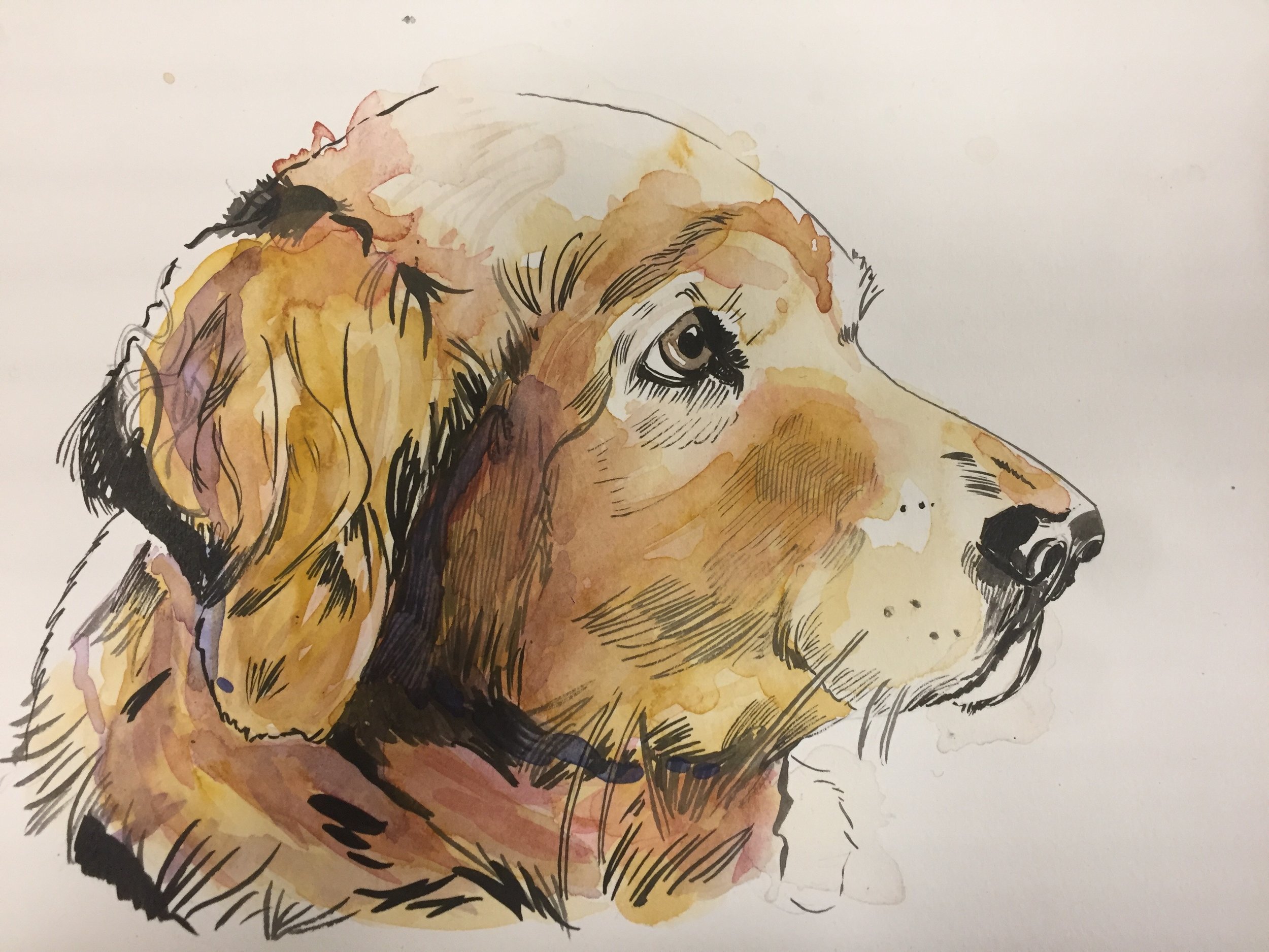
I was very lucky to work on a picture of a gorgeous golden retriever; an incredibly beautiful dog to get to stare out for hours. I sketched her with a 3H drawing pencil (I only this semester learned that the letters and numbers that go with drawing pencil correspond with how dark they are. The H pencils are lighter -- H stands for "Hardness" -- and the B pencils are darker -- B stands for "Blackness"); I like the lighter pencils for watercolors, although Peggy uses B pencils and her drawings are better than mine, so take your pick.
I have recently started to move away from the Pentel Pocketbrush (my favorite tool) and have been working with high-quality india ink (the quality really does make a difference; these days I'm using Winston, and I really love the way it turns out) and a size 0 brush. Chris Ware said that brushes wear down so fast you shouldn't bother to get fancy ones and should buy the cheapest synthetic version out there. I like Blick's Scholastic grade variety; they have blue handles and white bristles and cost about a dollar a piece. I find that the brush lets me get a cleaner, more accurate line.
I didn't take pictures throughout the color process for this, but I used burnt ochre, violet, transparent scarlet, and orange. The areas of shading are just violet and ochre layered on top of each other. This is about 12 layers of paint; I love how you can achieve a really lovely brown without using any actual brown. To get the spill marks I literally spilled some of my paint water intentionally on top of the work and then let it dry.
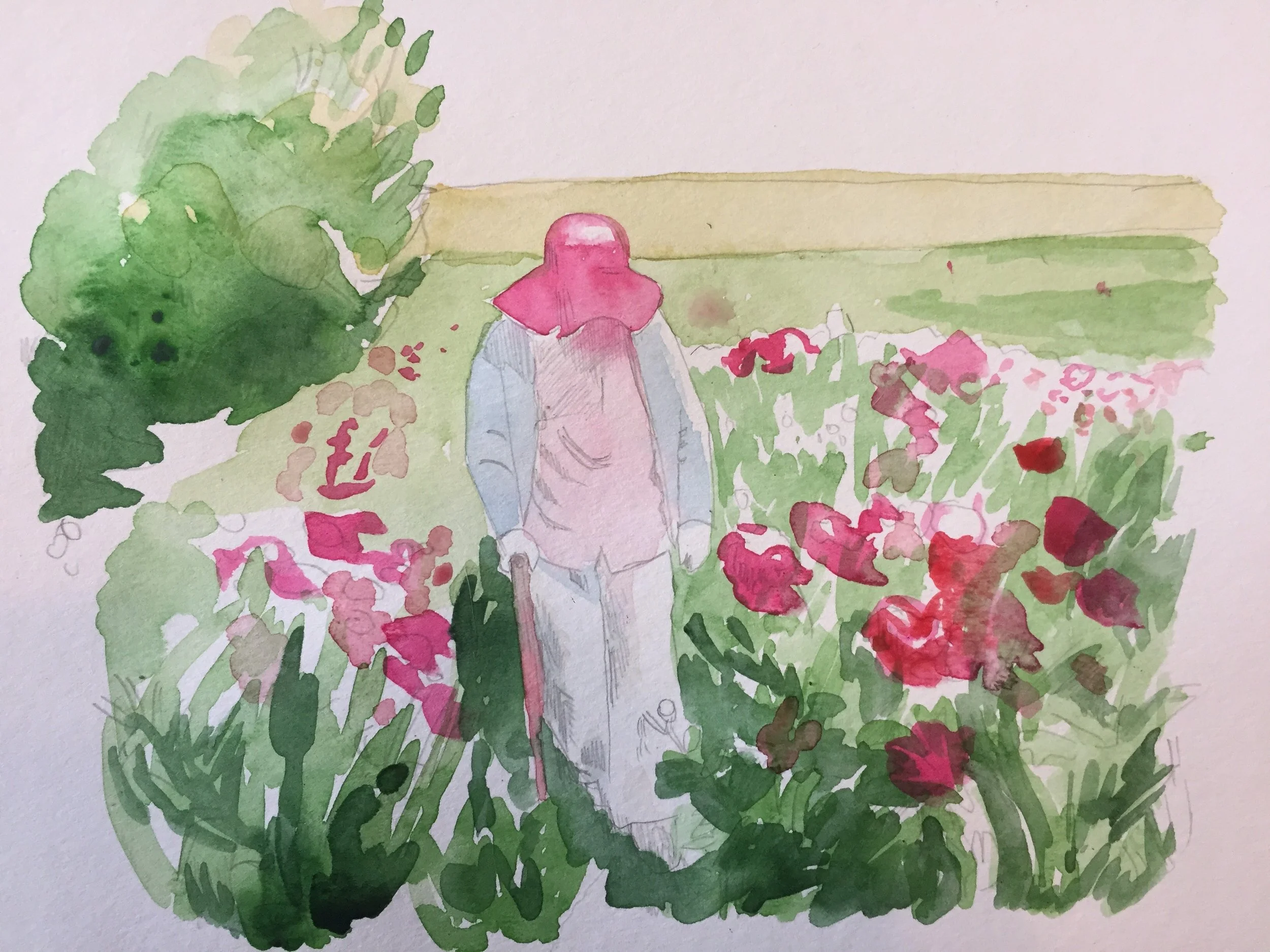
And here's Mysha's; I enjoyed working with color on this; I didn't use any ink here at all.
This is just three colors: hooker green, sap green, and rose. (And the sweater is turquoise, actually.) I watered down the colors to see if I could achieve different shades. I let it dry for 12 hours after this layer.
Then I went ahead and let some of the areas get a little wet. I like the bleed under her hat; I felt like I could work with that.
Just a few notes here: I went through the green and fleshed it out using some blue, which I think gave it nice shadows. Knowing that the woman's leg needed to come forward, I amped up the contrast there, as well as in the top of the hat. Peggy gave me some opaque watercolors to put on top of pieces; this has electric yellow and neon green (that's what I used to get the flower to come forward in front of her pants.) I finally went over the shiny parts with a Chinese white — easy to overuse, but effective in moderation.


